Reusing Areas In CSS Grid
I have been playing around with CSS Grids for some time now and it has been an extremely delightful experience. So much so that I have submitted a talk proposal at MetaRefresh 2017. If it gets selected, it’s gonna be my first time ever speaking at a conference. I am nervous. If you are gonna be at MetaRefresh and wanna know about Grids, go vote! 😊
Back to the topic…
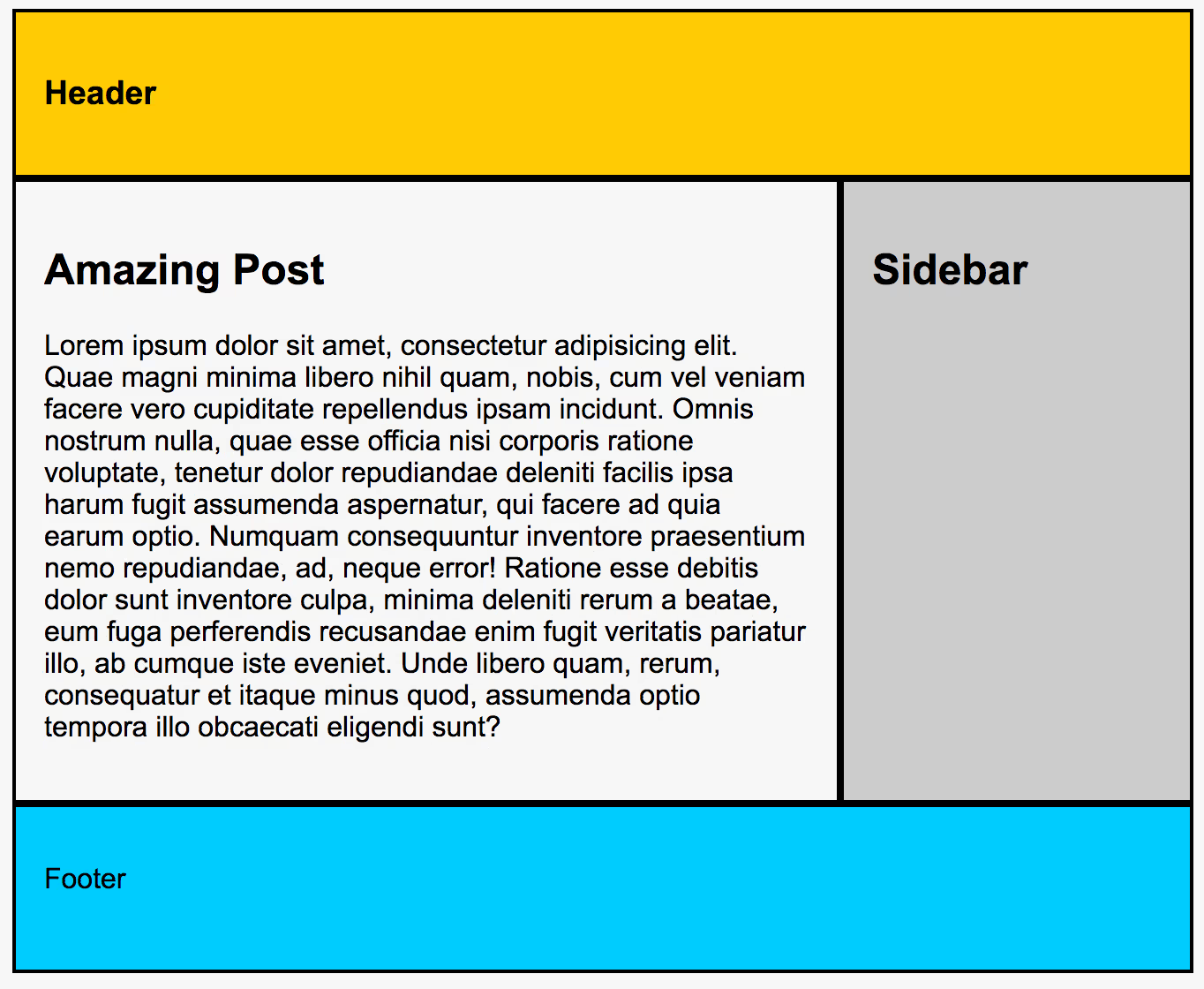
Grid has areas. We can define the entire layout with area names and ASCII art. For example -
.container {
    display: grid;
    grid-template-areas:
        "header header"
        "main  sidebar"
        "footer footer";
}
/* Assign areas...*/
.page-header {
    grid-area: header;
}
...
This is going to generate a standard two column layout grid. Something like this…

What’s great about area names is that we can reuse them. Confusing? Let me give an example.
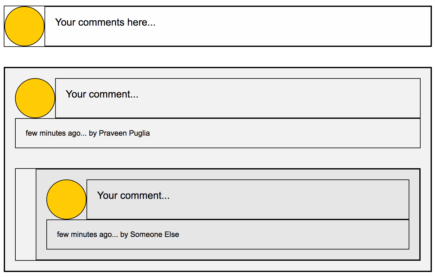
Say we are creating a comments section for a blog which has to look like this.

And if we add a little bit of borders, we see how the grid should be constructed.

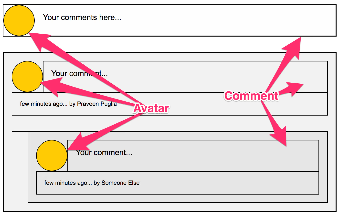
It’s clear that the avatar and the comment(input/text) is used exactly the same way in both the places. So, we should be able to create two grids, both of which can dedicate a place for avatar and the comment.
Here’s what I mean.

Here’s how that might look in code.
<!-- Comment Area -->
<div class="comment-input">
  <div class="avatar"></div>
  <div class="input">
    <!-- in real world, there'll be a text area in here! -->
    Your comments here...
  </div>
</div>

<!-- Comment List -->
<ul class="comment-list">
  <li class="comment-item">
    <div class="avatar"></div>
    <div class="comment">Your comment...</div>
    <div class="meta">few minutes ago... by Praveen Puglia</div>

    <!-- Nested Thread -->
    <ul class="comment-list">
      <li class="comment-item">
        <div class="avatar"></div>
        <div class="comment">Your comment...</div>
        <div class="meta">few minutes ago... by Someone Else</div>
      </li>
    </ul>
    <!-- Nested Thread Ends -->
  </li>
</ul>
… & relevant CSS.
.avatar {
  grid-area: avatar;
  height: 64px;
  width: 64px;
}
/* Comment Input */
.comment-input {
  display: grid;
  grid-template-columns: 64px 1fr;
  grid-template-areas: "avatar comment";
}
.input {
  grid-area: comment;
}

/* Comment List */
.comment-list {
  /* To make sure that nested threads take up the entire width of the grid. */
  grid-column-end: span 2;
}
.comment-item {
  display: grid;
  grid-template-columns: 64px 1fr;
  grid-template-areas:
    "avatar comment"
    "meta meta";
}
.comment {
  grid-area: comment;
}
.meta {
  grid-area: meta;
}
Things to notice,
- We declared two grids which greatly describe the relation among different elements.
- We totally reused the area names
avatarandcommentamong the grids. - We reused the
.avatarelement in both the places. - We created two different elements
.input&.commentwhich belong to the same area in both the grids but we still can style them individually.
To me, grid, in this case and many more like it, is doing a great job at establishing relationships among elements used on page and making it easy to understand for humans.
Here’s the final demo!
See the Pen A Generic Comments Section - Using CSS Grids by Praveen Puglia (@praveenpuglia) on CodePen.