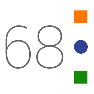
Design Story - Independence Day Cover Photo
Let’s have a look at it first.
Yeah! This is what I came up with when I had to put together myself, India and the Independence Day.
Essentially there were couple of thoughts going on when I fired up Photoshop and had a blank document of size 851 X 315. I told myself - I am gonna make something today that…
- …is Unique. ‘coz I did not want to put the same flat tri-colored flag image as cover photo.
- …should represent myself, what I love to do.( “design” ) and my philosophy ( “minimalism” )
- …should follow modern design trends where you use simple geometric objects to create the image.
- …finally keeps the feeling of Independence Day intact.
I tried couple of things like simple gradients, full-width solid colors and even simple square tiles but none of them really made me happy.
After spending “a lot” of time on the shapes, I settled down to the one above. I wanted two squares and one circle to represent the Indian flag at it’s bare minimum!
Then I had to choose the right colors. I needed the perfect colors for those small shapes on my layers window. So I fired up google and did an image search - “indian flag”. Then, I chose some of the best photos out there to analyze the colors used in them. The following colors looked best on a flat white background.
#FC7700#314294#158809
I was about to save the psd file and export as a .jpeg but it occurred to me that I should put the number of years of independence. Yet again, the color was really important. It should have been mild but sharp on a white background. I chose
#666666 as my text color.
There it was. I got what I needed. Minimal - Unique - Indian. :)
Show your love by making it your cover photo or use the cropped version below for instagram. Let me know what you thought in the comments below. Jai Hind!

